 |
| 2022 NHL Reverse Retros |
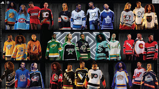
The Metropolitan Division Reverse Retro jerseys ready for my stupid opinion. We had to wait for some teams to debut their jerseys on the ice to get a full view of the uniform. Some of these images were hard to find...all were stolen from the internet.
 |
| Carolina Hurricanes |
Carolina Hurricanes 2/10
Fail! While it works in the black or white jersey version, the hurricane warning flags, being red, get lost and blended in to the red jersey. It looks like two white marks instead of a C, more like "-_ANES" or "=ANES".
Wordmark of the nickname is also a strike against this. Imagine if Montreal went with a diagonal wordmark of "HABS".
The greyed out storm warning flags on the waist is a good touch. Maybe incorporate those flags around the arm.
 |
| Columbus Blue Jackets |
Columbus Blue Jackets 7/10They could have easily gone overboard with designing the uniform. Admit it, this works. Columbus has a history of good jersey designs and great logos. That gives them a lot of room to play with win coming up with Reverse Retro designs. Also, that blue trim on the bottom of the pants nicely breaks up the black of the pants and socks. Not much more to say, I think they nailed it.
 |
| New Jersey Devils |
New Jersey Devils 10/10
Nailed it! A throwback to the Kanas City Scouts and Colorado Rockies uniforms. Just think, if the owners of the Devils kept the same colour theme as the Rockies, this is what the Devils would have looked like in their inaugural season.
The Devils did a great job despite having very little design changes in their logo and jersey history. Not much to play with. Okay, basically no change to their design other than changing from red/green to red/black. Their only third jersey design is the 'Jersey' design. Maybe next time, we see a red or white 'Jersey' design. Even better, a blue version of the Rockies Reverse Retro
 |
| New York Islanders |
New York Islanders 9/10
Yo, the Gorton's fisherman logo is back! Back in 1995, this was all the rage...and I mean rage! Many fans (and players) were not in favour this design. This logo lasted two seasons before it was replaced by the old familiar circle logo.
The fisherman logo is essentially the Islanders only exploration into a new logo. There have only been slight variations of the circle logo, which includes just the 'NY' logo, and adding a fourth stripe on the hockey stick (originally three) to represent the four straight Stanley Cups from 1980-1983. Meh, I think 'handcuffing' your history with, "we won four Cups"...also says "we only...and will ever only...win those four Cups". Like, what do you do if the team wins another Cup? Add another stripe? That means new logo, along with the revamping the entire catalog of merchandise. Sure that means more revenue, but now your are stuck with that 'winning identity' of four stripes with five or more victories. See how that complicates things? What if they go on another four Cup run?
Anyway, as much controversy the fisher logo caused in the mid-90's, this is what fans wanted. Credit to the Islanders, this looks good. What makes it work is the omitted teal and 'wave' stripe. Keeping the colours to their blue and orange, with a little white to make things pop, and a nice 'swoop' stripe brings everything togethers. This design will work nicely as a third jersey for the team.
 |
| New York Rangers |
New York Rangers 7/10At one point, the original NYR Liberty jersey, from the mid-1990's, was the best selling jersey in the NHL. So, it makes sense to bring this back as a Reverse Retro...again. Instead of going back tot he dark blue, they kept the Ranger blue. Again, it works. It works because the original was a great design, sales do not lie. It works because the Liberty logo says "New York" and is one of the best logo designs out there.
Unlike the other Original Six teams, the Rangers have done some experimenting with logo and jersey design. Okay, very little. They have the regular "RANGERS" wordmark, which is pretty much the only diagonal wordmark that works, only because that is all we know. There is the "NEW YORK" word mark that, at a glance, looks similar to the Rangers design, while there is exploration of font.
Then there is the shield logo, which looks 'wrong' because we are so used to seeing a diagonal wordmark. The logo makes it way on the shoulders of the Liberty jerseys. When they show the logos of teams on TV, they use that shield logo. The Rangers' shield is the only logo consistently used that is not the teams main logo.
 |
| Philadelphia Flyers |
Philadelphia Flyers 6/10
Cooperalls! Too bad they only wear the Cooperalls for warm-ups. The overall (ha!) uniform looks great. But, without the full roller hockey look, this jersey itself is kind of meh.
Like much of the Original Six, the Flyers (I know, not one of the Original Six) have a very limited pallet when it comes to logo design and jersey design. Outside of adding a border, once, the flying P logo has not changed. I mean, it has not changed at all. This is their only logo, with no secondary/alternate logo. Their only logo only comes in black with an orange dot. Yeah, even when they had black jerseys, they use the same logo. You can see one of the fans wearing a black jersey in the photo above.
They have a limited pallet of black, orange, and white. The cut of their jersey, while unique, has basically gone unchanged. Base jersey with strip running from neck down to elbow, splitting to wrap around forearms. Finish with band around cuffs, optional band around waist. That is it, that is their template for home and away uniforms. Oh, and the damn numbers on the arms always cross over the strip, sometimes blending into the sleeve. Fine, do that, but you need a contrasting border to make the numbers pop.
Okay, on special occasions the Flyers will opt for the 'traditional hockey jersey look' with stripes on the arms and waist. But, only for special occasions like Anniversary, limited thirds, and Winter Classic uniforms.
 |
| Pittsburgh Penguins |
Pittsburgh Penguins 8/10When the Penguins won back-to-back Cups in 1991 and 1992, they changed their logo to what is known as the "robo penguin". They did not win a Cup until they switched back to the "skating penguin"...also, that Sidney Crosby guy might have helped. Two more back-to-back Cups. It has been five years since their last Championship and the robo penguin is back after 20 years. What does this mean for their Cup runs?
The uniform looks good. While I love the yellow shoulder yokes, it maybe a little too much yellow...or maybe just enough. At times, the Penguins uniforms look a lot like a Bruins uniform. The large yellow patches of these Reverser Retros make them look more like Boston than usual. Yes, I get confused when I see a Pittsburgh vs Boston game. Upon further review, the large shoulder yokes looks more like Starfleet uniforms. Think first five seasons of Deep Space Nine and Voyager Anyway, the white trim around the yellow, especially the shoulders, work well. Otherwise, you may be watching Captain Crosby and the crew of the USS Penguin. Always loved the unique tapered striping on the Pittsburgh's pants.
Like most of the Metropolitan Division, the Penguins did a great job of design their Reverse Retros. Both versions of the Penguin are great logos. Perhaps they will bring back the yellow/white torso band from the mid-1990 third jersey design.
 |
| Washington Capitals |
Washington Capitals 7/10The eagle logo has one annoying flaw it shares with the Red Wings logo. It forces the C or A to the opposite side of the jersey. This more annoying as many of the teams have sold the upper right chest area for corporate sponsorship. The screaming eagle logo also does not scream "Capitals", but that is okay, as we get wordmark right underneath the eagle in a true 1990's diagonal striping.
Most of the teams that experimented with a new or third jersey design in the mid-1990's had a diagonal strip. There was new laser printing back then so they could print graphics and/or diagonal striping on the jerseys. Before this 'laser', striping was done by knitting. So, only horizontal striping was available. Unless you cut the template in a way to get vertical or other fancy colour breaks (see Flyers).
Back to this eagle jersey in black. This is the first time we see the screaming eagle in black. It had only appeared on the white or blue jersey, never in black. The black thirds you are thinking of had the Capital building logo (also with different striping)...which makes sense. Capitals. The logo appears on the shoulders on this design. Great that Washington did a Reverse Retro combining elements to something very familiar, yet very different. Ovechkin played his first few seasons in the screaming eagle (white) and Capital (black) logo era.
One more comment on colours. Strange that a team from Washington DC would use blue, black, and gold as their team colours. Glad they when back to red, white, and blue. The previous Reverse Retro with the screaming eagle on red jersey was really good.


