 |
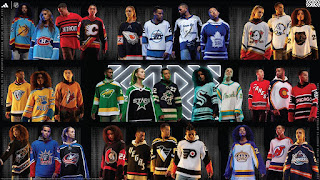
2022 NHL Reverse Retros
|
Finally, the Pacific Division. After this, I will be done...and you will not have to read about my stupid opinions. At least, until the next Reverse Retros come out. Less work for me, as there was a lot of research just looking for good images of these uniforms in action. Less work for you, of course, you can just skip this for something way more interesting. But, there will be some interesting facts and theories in this entry.
 |
| Anaheim Ducks |
Anaheim Ducks - 8/10
Admit it, the Disney logo is the better logo. Another all-time-great logo in sports. People whined about Disney buying a hockey team to promote a movie. Yeah, so? It takes years and a lot of money to start an NHL franchise. Disney just one day said, "hey, how about we promote this mediocre movie franchise by starting a hockey team...in Southern California?" And, they did! Bonus, they had some of the best designers in the world designing the logo and uniform. Although, if I know my licensors, I am sure the designs went through thousands of rounds of changes.
Pretty much anytime a team goes with orange, green, and/or purple, you have a winning combo. Heck, the original colours of the Mighty Ducks were green and purple...sorry, "jade and eggplant".
Oh, the design. Anaheim has a good history of design. Yes, even the Wild Wing jersey is awesome! Why else would that be their first Reverse Retro? The lone not-so-good design is the wordmark logo. But, they fixed that by just using the more legible D logo. This season's Reverse Retro, is a good execution using the logo and template of their original uniform, but replacing it with current colour pallet. Again, the orange is key here. The Ducks could have easily (and lazily) stayed with black pants, but those orange pants are fire! These uniforms pop on ice.
Another reason to love this logo...it is the one worn by Paul Kariya!
 |
| Calgary Flames |
Calgary Flames - 8/10
Ah, the pedestal jersey. Back in the mid 1990's, a new technology allowed ink to be laser printed on fabric. Which, for teams in the NHL, jerseys with whacky stripes and not limited to traditional basic horizontal striping (or major change in the template). Coming out of the lockout shortened season, the Calgary Flames were one of the teams that used this new technology and gave us the pedestal. The pedestal jersey era was the dark years for the Flames.
While I am not a fan of black uniforms, more on that later, there is enough accent colours here to balance out the black. This is the first time we see the Flaming C logo on a black jersey (as a main logo), as other black jerseys featured Blasty the flaming horse head. Is the white Flaming C too bright? Would a yellow Flaming C, and numbers (on back) work better? I get it, this is the same white Flaming C from the mid-1990's with black and yellow trim. But, ponder this...yellow C with red and white trim, same with back numbers. Keep the numbers on the sleeve the same as the white and black trim work well against the red.
I also dig the pants. Back in the day, I got some scrap vinyl and hand sewed this exact pattern on my hockey pants. I even did the same pattern on the 'midsoles' of my skates with coloured electrical tape. All this to match my white pedestal jersey and the socks. Still have everything, I even made a hand sewed and painted a mini jersey, using the vinyl pieces to make the Flaming C crest. Nerd!
 |
| Edmonton Oilers |
Edmonton Oilers - 8/10
Remember when Todd McFarlane was part owner of the Oilers? Remember when he designed an alternate jersey for the team? Remember how many thought that design was lame? The original design of the jersey was a navy blue base with grey (silver) and white trim. This Reverse Retro added the orange that the original needed to make everything pop. I get it, you want a cool looking third jersey so you go brooding comic book dark with monotone theme. Hence the dark navy blue and minimal colour accents...think Gotham City Oilers.
Speaking of monotone, the Oilers' current alternate uniform, the blue and orange one, is crap. Damn, what an eyesore. When you have complementary colours like that, on a uniform, it needs some white (or other accent colour...not black) to break things up. It just does not work. Get rid of it.
Anyway, this crashing-mechanical-oil-drop-on-a-space-sprocket is the first and only time the main Oilers logo is not on the jersey. The alternate uniforms had a good run for a few years. Maybe they got rid of it because fans did not think too much of it. Maybe it was gone because McFarlane sold his part of ownership. Or maybe they did not want to be know as just winning five championships. See the five rivets on the gear? Yep, those are the five Cups. As mentioned in my write up on the Islanders, I am not a fan of tallying the teams championships on a logo. Okay, they got rid of this design (partly) due to change in jersey template throughout the league when Reebok re-designed all the NHL jerseys.
 |
| Los Angeles Kings |
Los Angeles, Kings - 9/10
Nailed it. Prepare for a history lesson and why purple and gold is the direction the Kings should go and never should have moved away from.
When you think purple and gold, you think royalty. That is why these colours were chosen to represent the Kings. The Kings are the only major sports team originally from and stayed in Los Angeles. Sadly, when you think purple and gold, especially in LA, you think Lakers. Well, the Lakers were originally from Minnesota (where there are lakes). The original colours were blue and white...like water. When they relocated to LA, they keep the name and colours.
Meanwhile, the Kings were the royal purple and gold. With the Lakers and Kings playing in the Forum, the Lakers changed their colours to match the Kings. Yes, Lakers' colours is really Kings' colours. Then in 1988, you had two things that literally changed the look of the Kings forever. Under new ownership, the Kings were looking for a new identity. With the popularity of the Los Angeles Raiders, and their merch selling like crazy. The Kings abandoned their royal colours and adapted the silver and black. They also had a blockbuster trade that brought in Wayne Gretzky.
The silver and black design is boring. It just looks black and white. In this age of big screen colour television, we are watching a black and white hockey game in hi-definition. All that glitz and glamour in LA and you go with black and white.
Oh, I am not done. The Kings' current logo is crap! It sucks! The crown was their best logo, see Reverse Retro. They Chevrolet logo was a far step down...you jack the font from the Lakers and colours from the Raiders. They brought back purple to complement black and silver. They played with a shield design for a while and even designed a new crown logo. But, take a good look at the current logo. It is home plate! Now, they are jacking home plate from the Dodgers. The worst part is the Kings won two Cups in that jersey/logo, so no way they are changing it anytime soon...and that stupid baseball home plate is in the rafters, representing their hockey team. Ugh!
Anyway, this Reverse Retro is a win simply for not borrowing from other LA teams and bringing back royalty and originality to the Kings.
 |
| Seattle Kraken |
Seattle Kraken - 5/10
Uh, okay...I guess. According to the press release, the design "honours the 1943-44 Isaacson (Seattle) Ironmen of the Northwest Industrial Hockey League (NIHL)". Remember what I said about vintage jersey designs? They are limited to horizontal striping due to stitching techniques.
Giving the Kraken a pass on this design (sort of), since this only their second season in the league. No real 'history'. But, why not use that awesome secondary logo seen on the shoulders? Yeah, that one! The awesome anchor with the Seattle Space Needle. How about that Metropolitans jersey they were teasing when before they named the team?
I think they could have done something better/different. Without knowing the history of the city and its relation to hockey, the Ironmen tribute is a deep dive. This just looks like a third...a good third, and a good enough Reverse Retro, under the circumstances
 |
| San Jose Sharks |
San Jose Sharks - 8/10
Wow, the Sharks nailed it with this design. Since they are limited in logos, it was great move to dig deep into Bay Area NHL history with this Golden State Seals tribute uniform. The Seals went through a few uniform/logo changes in their short history. This design was from the last few seasons in Oakland, before they relocated to Cleveland.
Fortunately, the Sharks have a pretty good history of uniform designs. Okay, a few flaws...and you know where I am going with this. Yep, the black jerseys. At one point, every Pacific team had a black uniform. Boring! Although they have modified their logo to give it a more 'modern' look...similar to the Flyers, the Sharks do not have separate logos for home and away. They have one logo. So, that logo did not pop against those black uniforms, especially when they removed the triangle (which may have helped it pop) on the black uniforms. Hey, how about a grey (silver) shark?
By the way, this is the first time the Sharks have something other than their logo on their jerseys. For a few seasons, the Sharks had their main logo on the front, and on the shoulders of their jerseys. That is too much. The fin logo on the shoulders was a nice touch. Good to see that is back...could work as an alternate logo.
This Reverse Retro design is a great look. The Seals knew they were on the right path when they picked these colours. Just ask the Flint Tropics from the ABA. But, imagine if the Sharks went with the yellow/green (Oakland Athletics) Seals uniforms...with the white skates. White skates are awesome, just ask Sergei Fedorov.
 |
| Vancouver Canucks |
Vancouver Canucks - 7/10
Bro, what are you doing? The Canucks almost had a perfect design with this Reverse Retro. But, they done screwed up. So much good happening with this design, and one stupid design-by-committee ruined it. Good news is, there is an easy fix.
The good parts. It looks retro...and I do not mean "Reverse Retro"...I mean, it looks timeless. The proportions of the stripes are spot, with the green balancing out the blue. The elbow strip repeated on the socks. The Johnny Canuck logo is the Canucks' best logo. Yep, first time used as a main logo on their uniform. Bonus points for having lace-up collar...retro and timeless.
The bad. Look where the Captain C is located. Yes, I bring it up every time a team does this...because the C/A belongs on the left side of the uniform. Why is the C/A forced to the right in this design? There are numbers on the left side! What is this, some sort of Bizzaro world? Numbers do not belong on the front of a hockey jersey. That is another strike.
Wait, there is more, look at the left arm...what is missing? Yeah, the jersey number...there is nothing there. Hold on, going off on a tangent. Remember when the league added numbers to the front of the helmet so "refs and identify the players better"? Well, good luck identifying the players when they are skating right to left, you cannot see their number. This is almost as bad as shoulder numbers. Some intern must have shifted the the C/A and jersey number before submitting the design to the league...and then some intern in the league front office approved it.
Since this is just a limited edition uniform, it gets a slight pass. Like I said, this is an easy fix. When...yes, when...the Canucks make this design their main uniforms, they need to do it properly and move the C/A and number to their assigned positions. If you are a Canucks fan, let the organization know. If you bought or plan to buy this jersey, get it customized with name/number/captain...and ask them to put the letters and numbers in the right place.
 |
| Vegas Golden Knights |
Vegas Golden Knights - 11/10
Winner, winner...chicken dinner! In their short history, Vegas has nailed every jersey. Their regular home and away has patterns and textures on the logo and sleeves. They went with grey as their dark jerseys. For their whites, they have matching white gloves...the first to have home and away gloves.
In true Vegas fashion, they went with a gold...and I mean GOLD...for their alternate jersey. With limited history, their first Reverse Retros honour the Las Vegas Thunder, using their template. They did this in red, with their secondary 'star' logo. I mean, come on! Sure, those retros looks a little like the 2003 Flames jersey, why mess with great design.
Now for their fifth jersey design, Vegas goes with a black uniform. They had two previous chances to fall back on a black jersey, but they waited until now. You know how I generally feel about black uniforms. But, the Golden Knights do a good job with enough accents to warrant a colour television. Striping is good. Again gold for Golden Knights, not yellow, but gold with sparkles. Great selection of font choice, even though wordmarks in general are lame. The VEGAS font is from the Excalibur hotel, while the number font is from the old Stardust hotel. Can you get more Vegas? Yes, you can
 |
Glow in the dark!!!
|
Oh, I should mention that parts of the uniform GLOW IN THE DARK!!! The white elements, the front VEGAS letters, player's numbers on back and arms, trim around the shoulder logos, adidas logo on back of neck, trim on pants, and off course the corporate sponsor logo all have lume.
Yes, I would buy one just for the lume.
There you have it, some rando's opinion on the 2022 NHL Reverse Retro jerseys for all 32 teams. Thanks for making it this far. The adidas contract runs out next season (or season after), so there will be a new uniform manufacturer and new designs. Until next time...
